

-
![]()
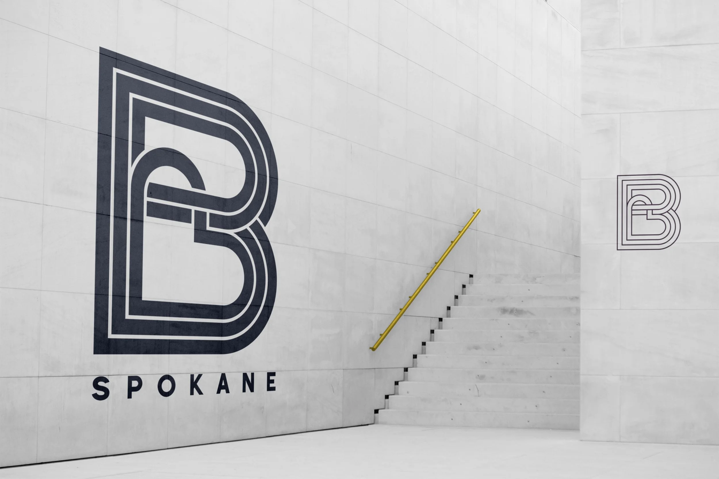
B
B is one of the coolest projects we’ve ever worked on. It’s massive in scale, scope, and intention.
A joint project between Thrive and the Spokane Library to provide a community center and living and learning to new Americans, it’s absolutely beautiful.
We were tasked with all of it. The name, the branding, the vibe, and we loved B. Just B. Just b you. Just b here. Just… you get it.This is another one we absolutely can not wait to see grow into everything it can be!
Article -
![]()
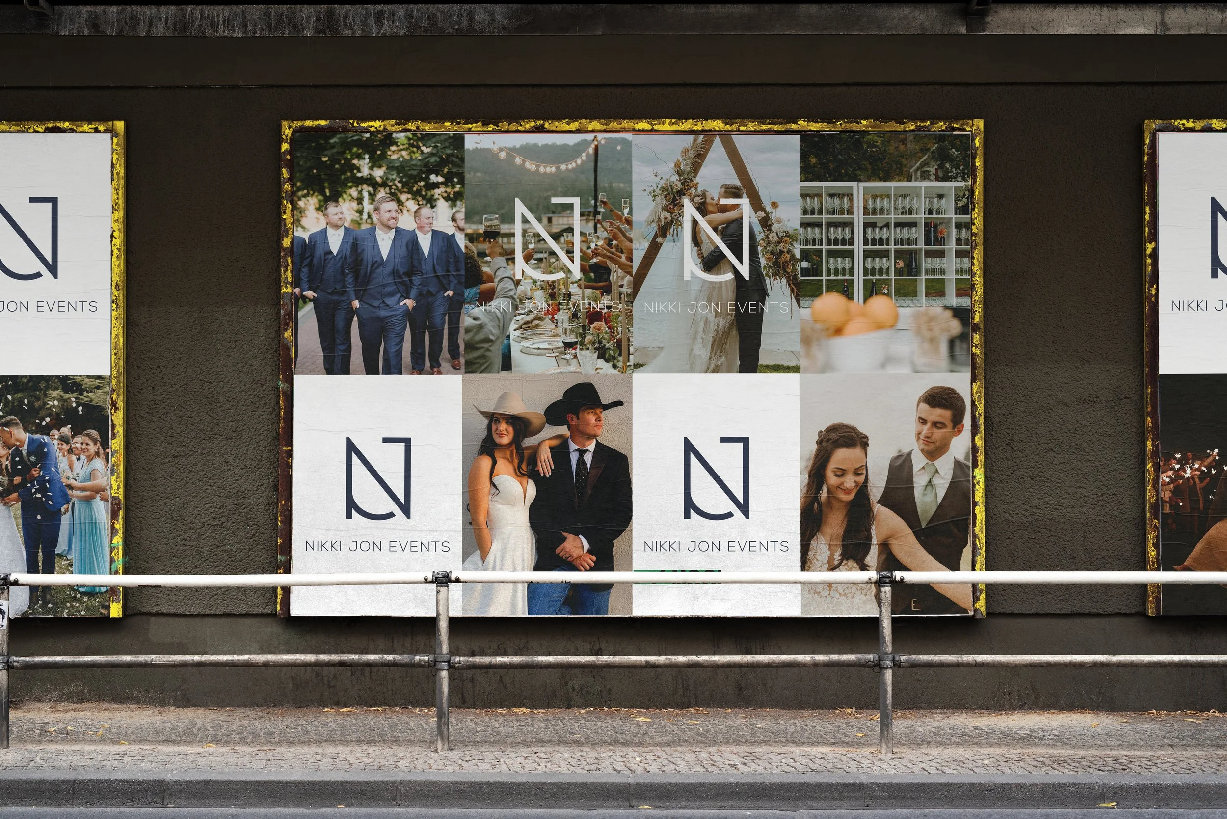
Nikki Jon Events
Nikki is another amazing planner who needed som new branding. And we were here for it.
Did we go a little too far in the early branding? Maybe. But we were all about ready to pull the trigger until we realized it didn’t quite fit the Texas wedding vibes and we pulled back to, honestly, something that worked better than our original. Glad you spoke up Nikki! :) All part of the process and fun if you ask us.
-
![]()
Fratello's
We got to do another restaurant with Lauren (who is the best - and an absolute bad ass) and we had so much fun with this Italian sandwich shop. It was a slightly different vibe for us (who like that Nordic design style) and we even gave her one that still had it but she went with the traditional and (just perfect) vibe for her amazing food!
Instagram -
![]()
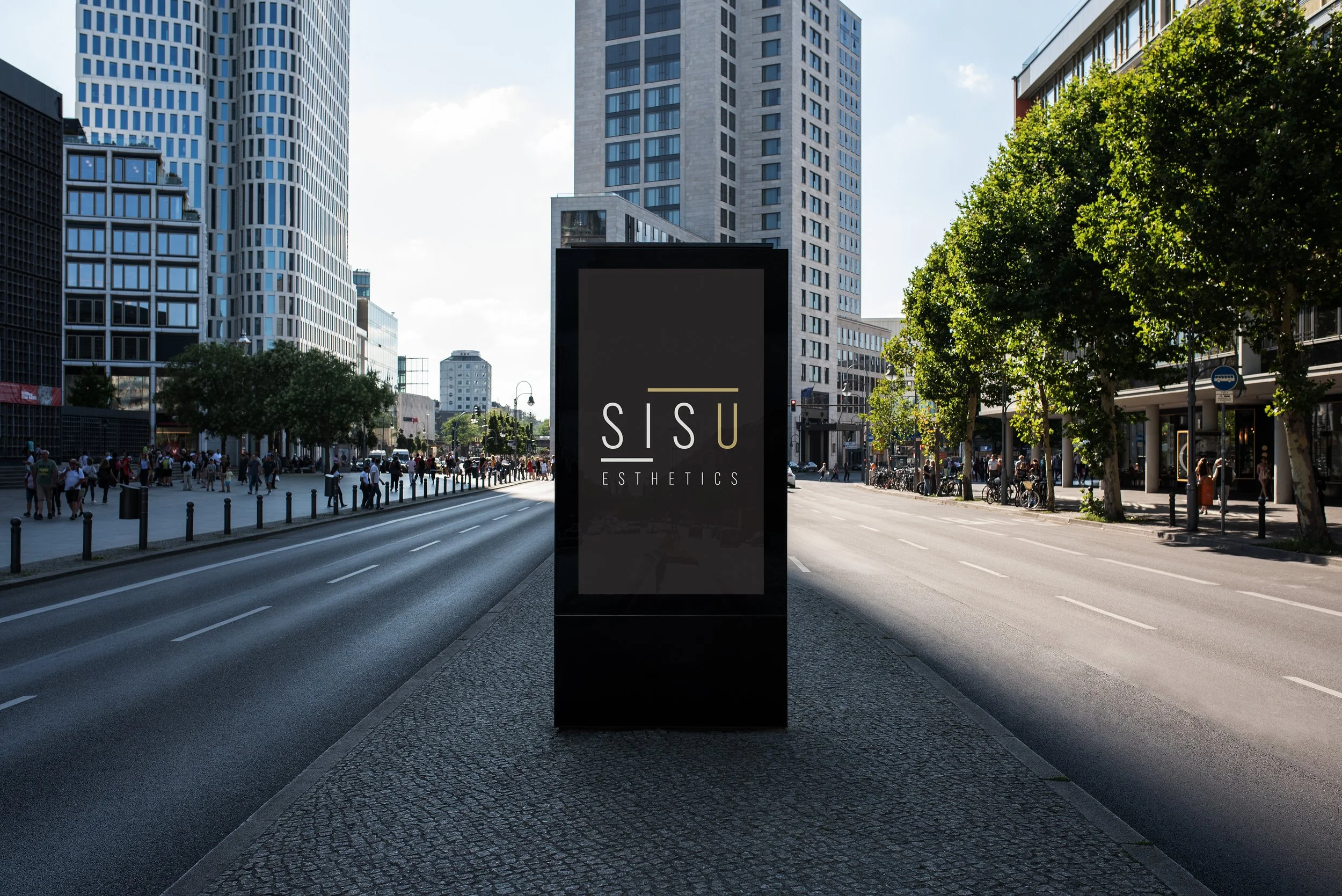
Sisu Esthetics
Sisu is the Finnish word for “grit, strength, resiliency, etc…” Mari loved the Nordic aesthetic (not to be confused with esthetic) and wanted that clean, simple, look with a sense of what the word means, of course.
Being huge fans of Nordic design ourselves, we had so much fun with this one. At the end, it’s got strength, grit, and clean inviting lines. -
![]()
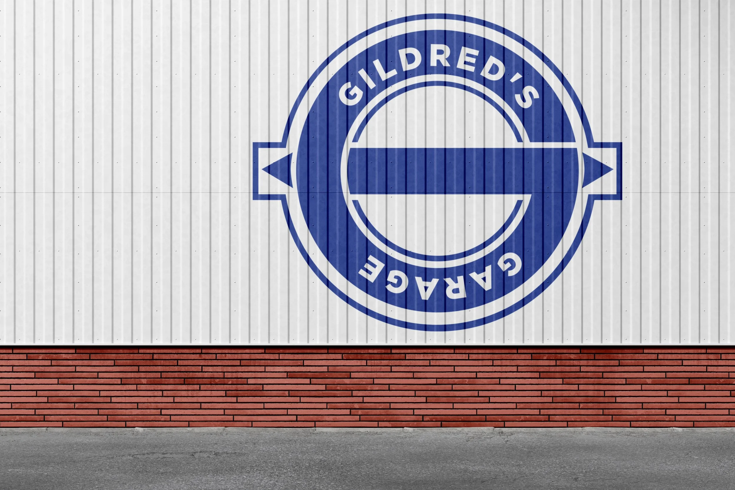
Gildred's Garage
Gildred’s is so cool. Under Excelsior Northwest, Gildred's Garage is a vocation program to introduce kids to skills relevant to electric engines.
The ask was simple. Traditional garage vibes and some nods to Ted Gildred. We think we pulled it off and we’re excited to see this whole thing come to fruition.
Article -
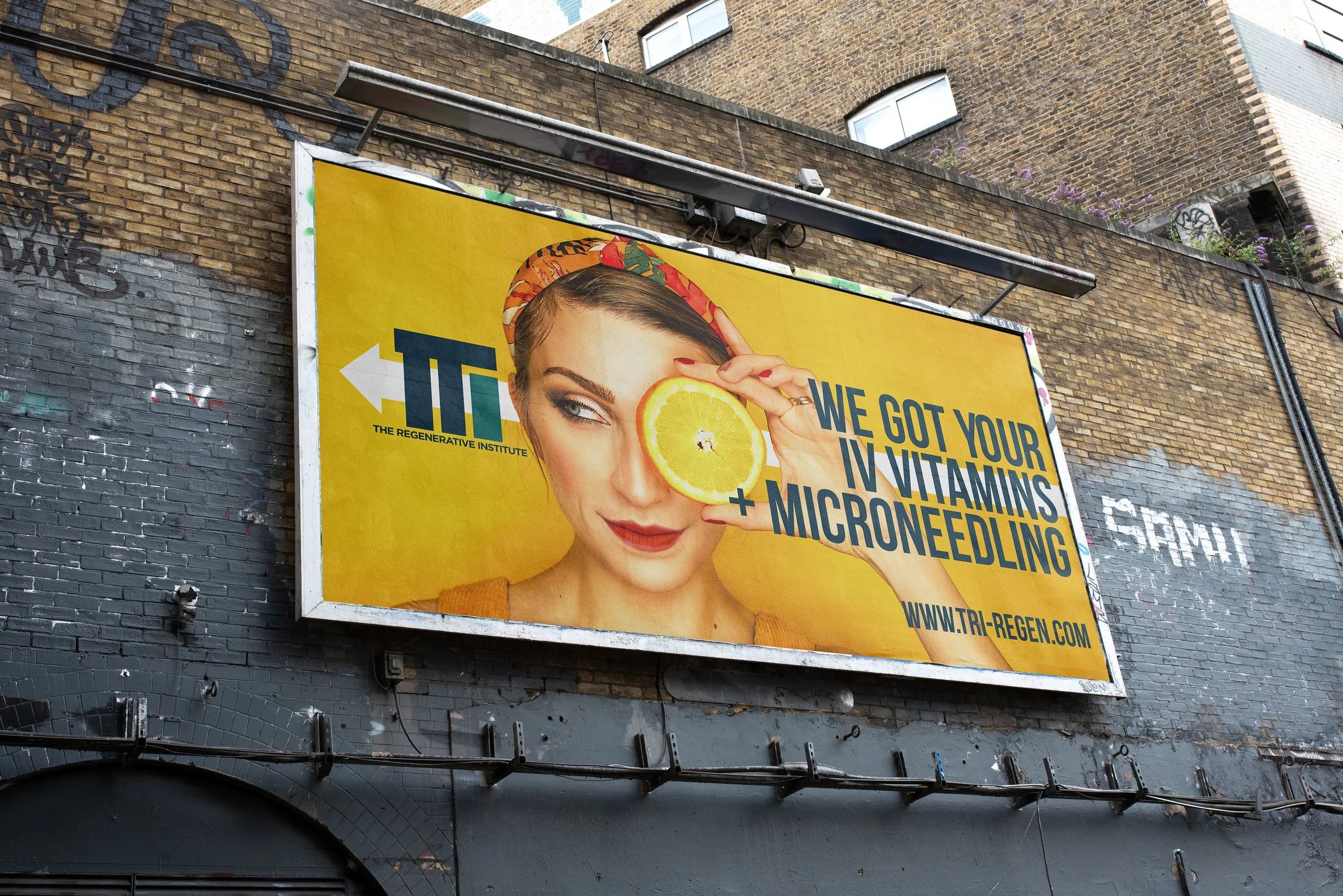
![]()
The Regenerative Institute
This is one of the rare branding jobs where we knew the logo before we were even hired. Honestly, we told Dr. Pasma, listen we have your branding so hire us and we’ll get it done. He did.
TRI (for short) is a very hip, so clean and modern, sports rehab medicine clinic and medspa. It’s got the best vibe! The branding needed to represent the trust and clarity of medicine but also we get to have lots of fun with other elements of the branding, i.e. the billboard.
-
![]()
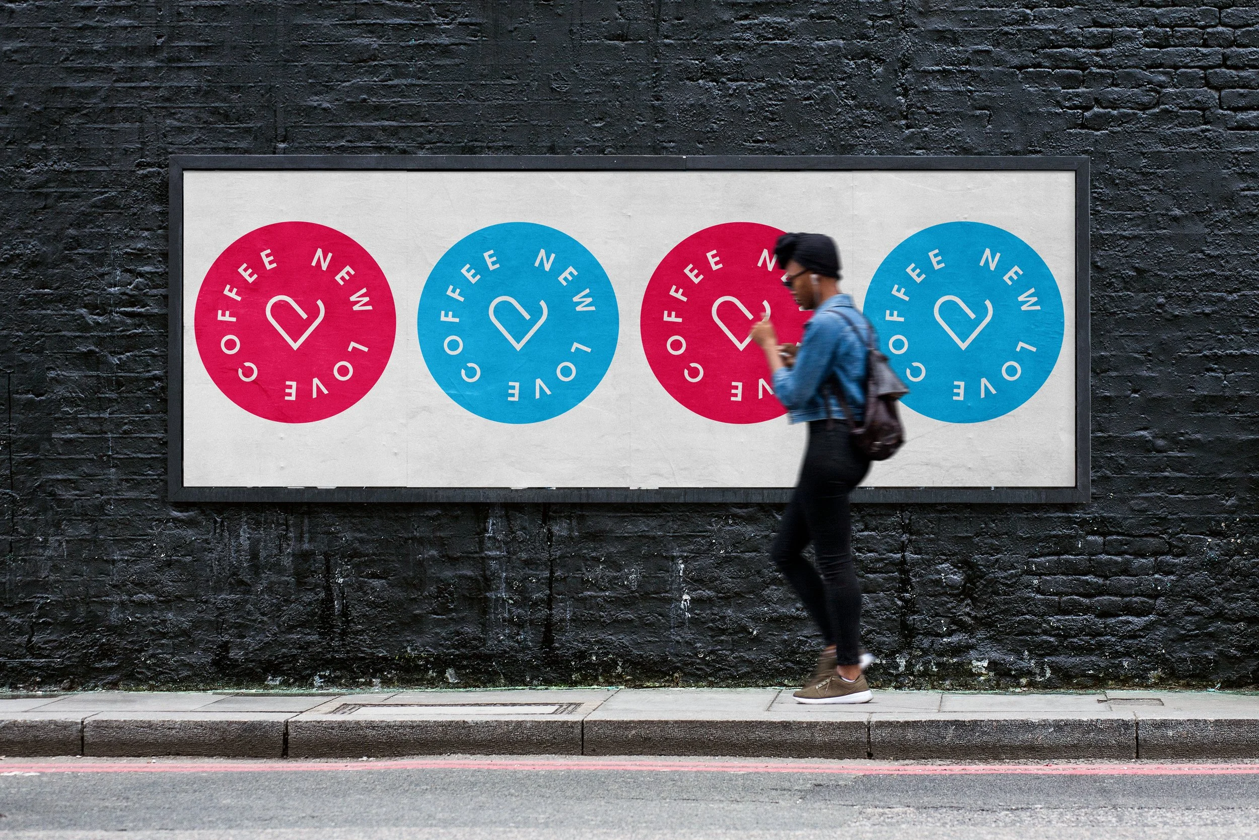
New Love Coffee
We sat down outside of a coffee shop (of course) and talked about a whole new idea for a coffee shop with Ike. Ike was a roaster who knew coffee in and out and wanted something that stood out (as much as his coffee would) in a crowded field.
We had a lot of fun with colors, and NOT doing the classic mug and a heart logo - that’d we seen too many times. So at the end of the day, we came up with a much more subtle mug and heart and it really worked, especially with the fun color pallette. -
![]()
Re Fitness
Okay, maybe the easiest branding, we’e ever done. We were walking down a street in NYC and we knew that Jesse was thinking about starting a barre/spin studio and hiring us for the branding, Anyway, walking down the street, Ryan looked at Heidi and said, “got it”.
It’s called “re” the color is green, and the logo is in my brain. Part someone doing barre, part someone cycling and the letters “re”. Done. At least that’s how we remember.
Little did we know, years later someone would come with re counseling but, hey, it’s a great word! -
![]()
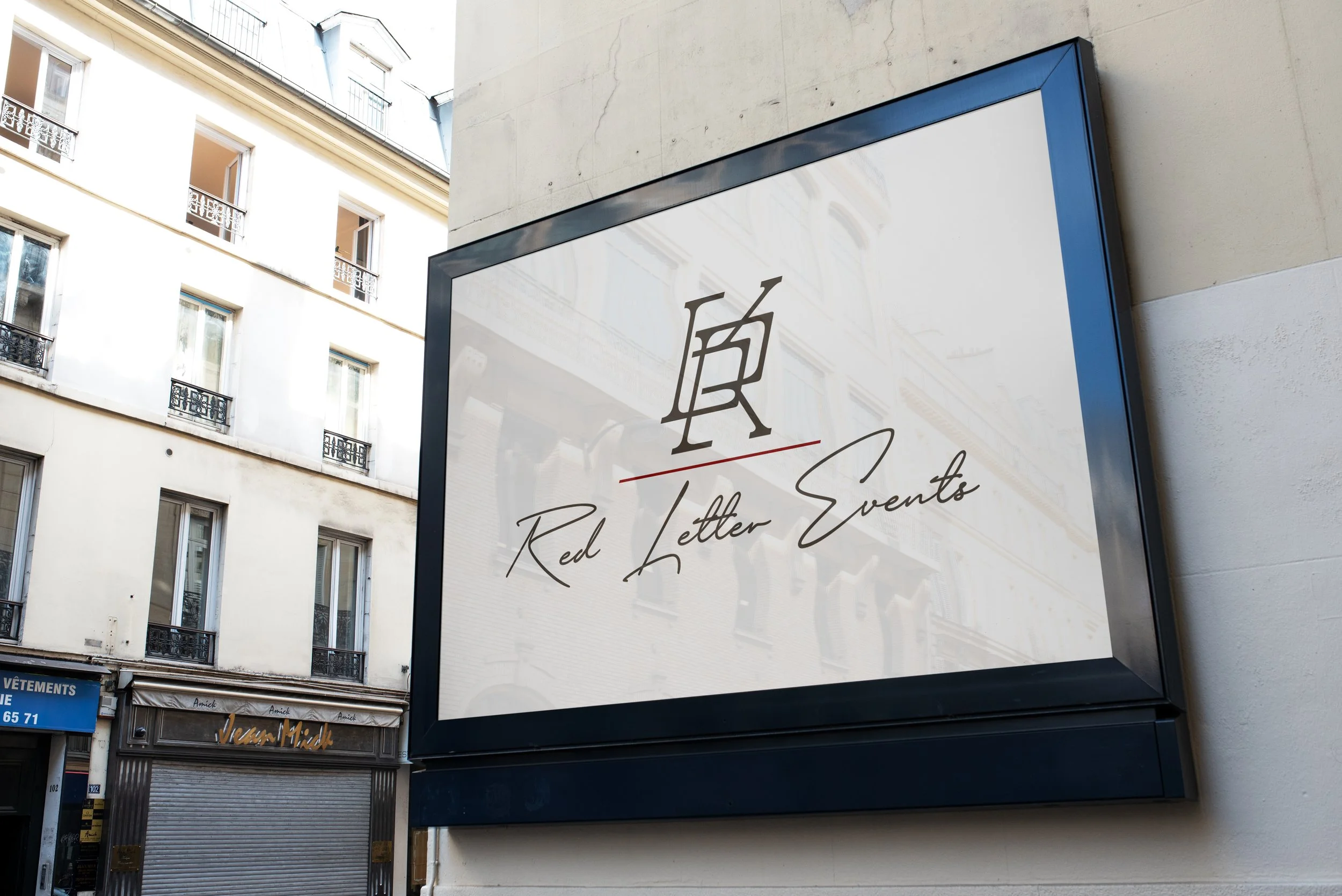
Red Letter Events
Talking with Jessica and Reagan about their brand was one of the best. We don’t want Barbie, but we want class, we’re bad ass women (and they are) who will do anything for our clients but we’re not crass and unprofessional. In a sense, we ride the line with a lot of what we do and it’s that line that makes us who we are.
We wanted a perfect blend of high class Italy and badd ass-ery along with elegance and… well we had to have that red line on there somewhere. -
![]()
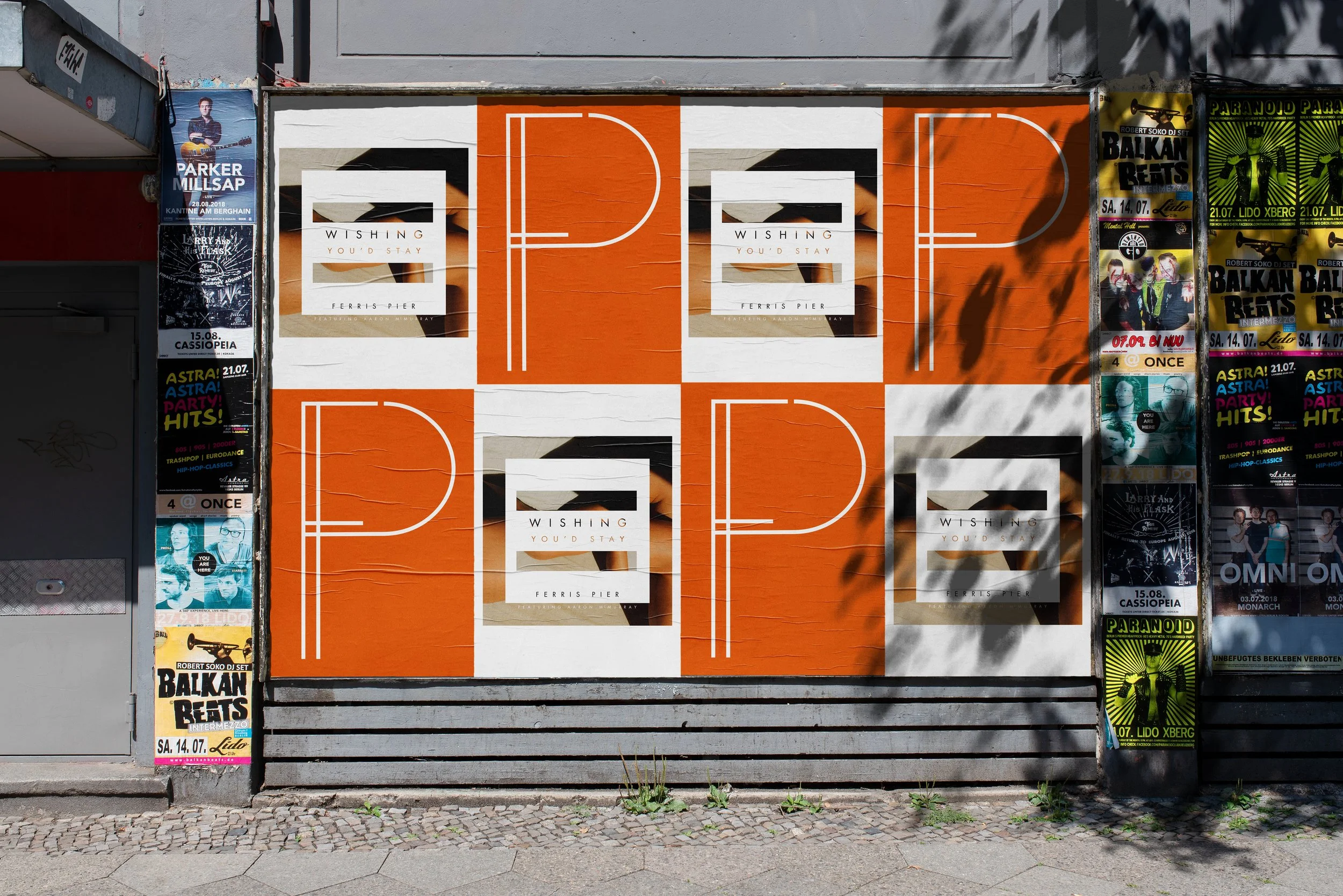
Ferris Pier
Ferris Pier is like a blast of sunshine and color through music. You will feel good.
We’ve designed all of their funky album covers and a cool logo that would fit on some of those logos but not be required for any of them either. Think European Rooftop vibes and you’ve got Ferris Pier. -
![]()
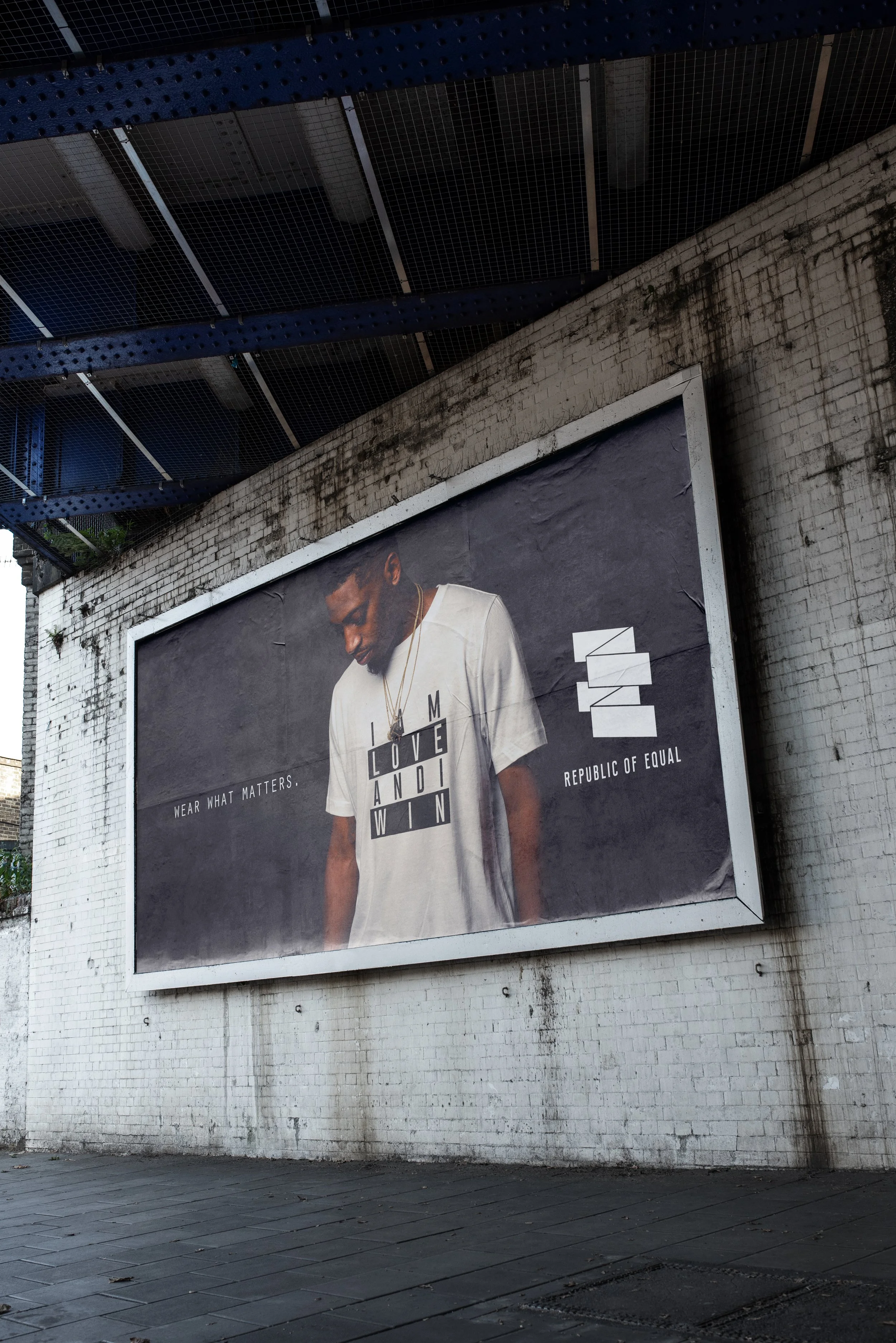
Republic of Equal
Republic of Equal was actually started by us in 2016 in response to the election. No, we’re not getting political but we are getting preachy about equality because we value it immensely around here. (Ryan has tattoos that represent equality.) Love, kindness, respect, and treating people from all different perspectives, viewpoints, and nationalities as we treat ourselves is important and this line meant to remind us all that we’re all human. We sold the brand (and kinda wish we hand’t).
Oh, the logo, yeah equal signs and a nod to that old school republic/country/national feel was important. -
![]()
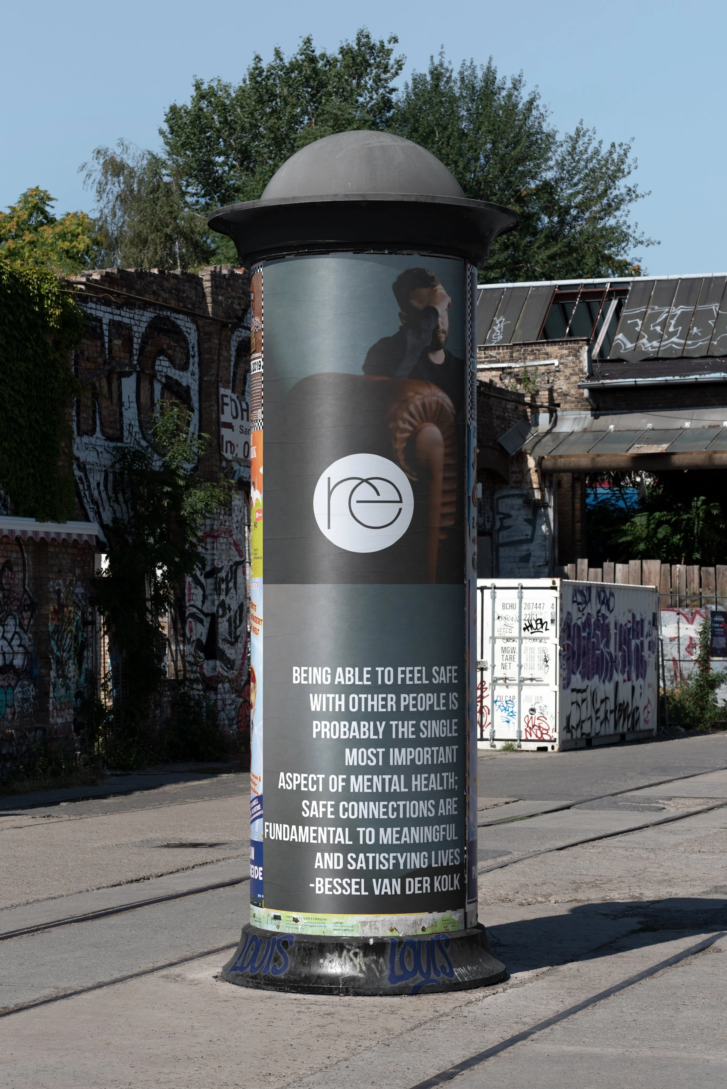
re counseling
Re is the best word (and why it’s been used twice in our portfolio?) but for a counseling service it really flows nicely. Renew, relationships, you get it. With a counseling service you’re not trying to “sell” anything other than calm, trust, and help and with this branding, that’s why we tried to do for Julie. Keep it straightforward, trustful, and connecting, like the services offered at Re Counseling.
-
![]()
5 Design
Liz and Melissa came to us wanting to show off their amazing clean, simple, elegant interior design skills and put them into a mark that represented the same. They each have 5 kids which make up a huge part of their life and they wanted that 5 on the logo to do the same.
We added some nice cremes and beiges and voila!
-
![]()
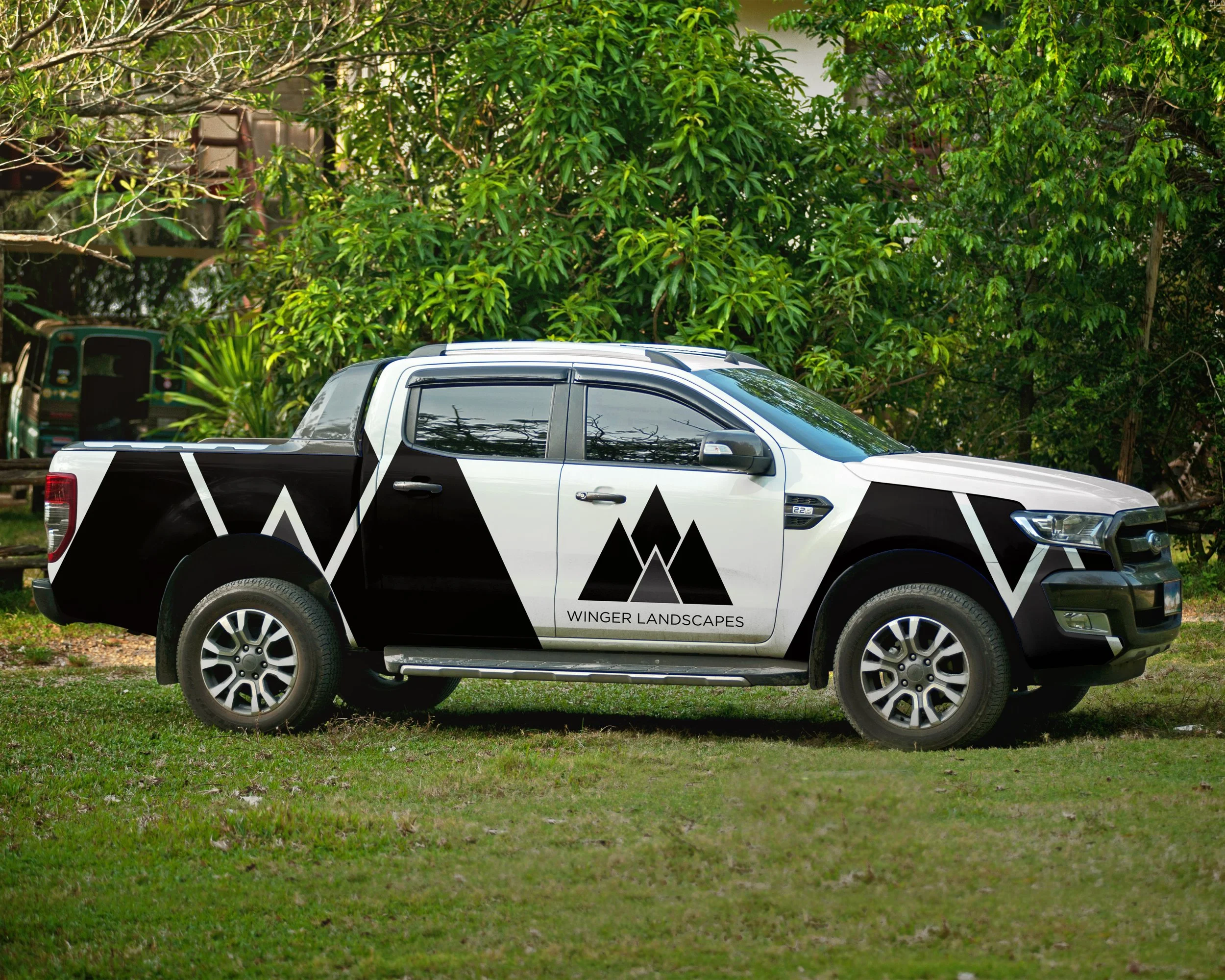
Winger Landscapes
Aaron came to us needed a rebrand for his landscaping business. Something a bit more modern and ready to go.
Located in the PNW, we thought of mountains/trees and a W hidden in there somewhere. And that’s what we got.
-
![]()
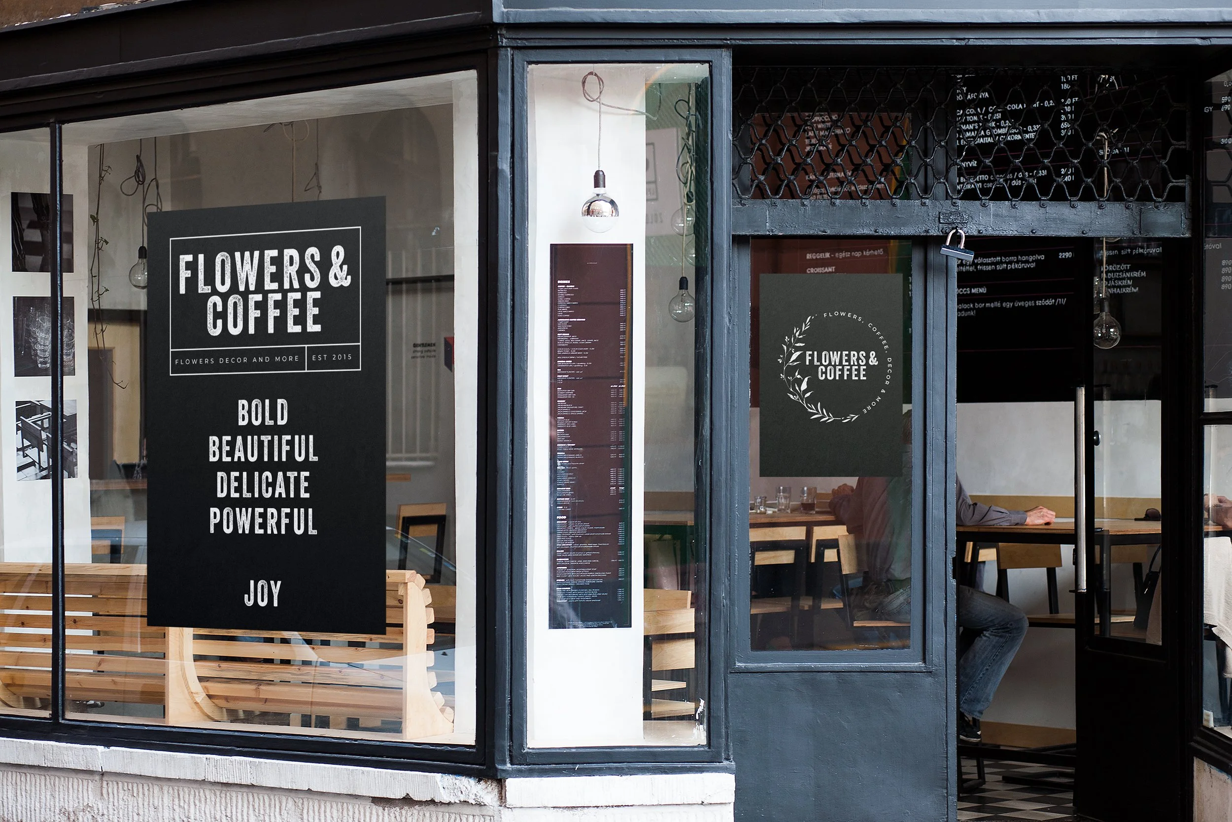
Flowers and Coffee
Pretty clear, Flowers and coffee. We could have gone with all kinds of flowers growng out of coffee mugs but a bold black and white design felt much better with what Shelly was doing. Clean, bold, and so nice with menus - that black and white vibe.
In addition to the main idea, we did have some secondary branding that brough in those flowers and a litlte more softness.
-
![]()
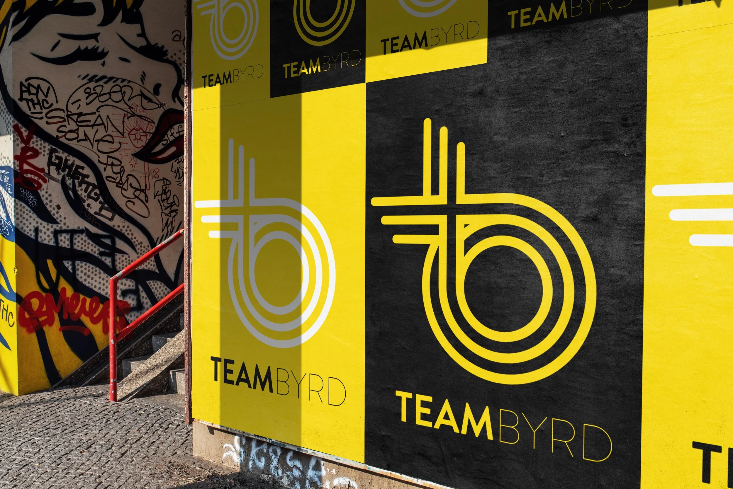
Team Byrd
Amy came to us as a succesful businesswoman who was so succesful she basically had her own team of more succesfu business women under her.
Obviously, we neeed to have some fun with her name. So we came up with a fun logo that incorpopated a bird, a b, and lots of people working together to form something even bettr than the indiviudal parts. Boom.
-
![]()
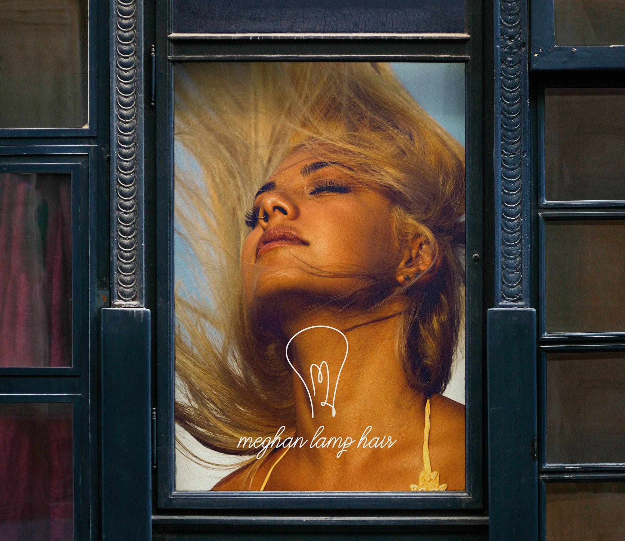
Meghan Lamp Hair
No we didn’t put scissors in the design but we did put a light bulb because we couldn’t resist it. M and an L and a light for Megha and her salon. Classy, fun, good vibes and precision.
-
![]()
Sorella
Lauren traveled all over Italy, tased all kinds of good food, with the intent of using her restaurant experience to bring the best of Italy to Spokane.
She had a very specific vision and it was an “s” written with all the flair of Europe, class, and good food. And there you go.
-
![]()
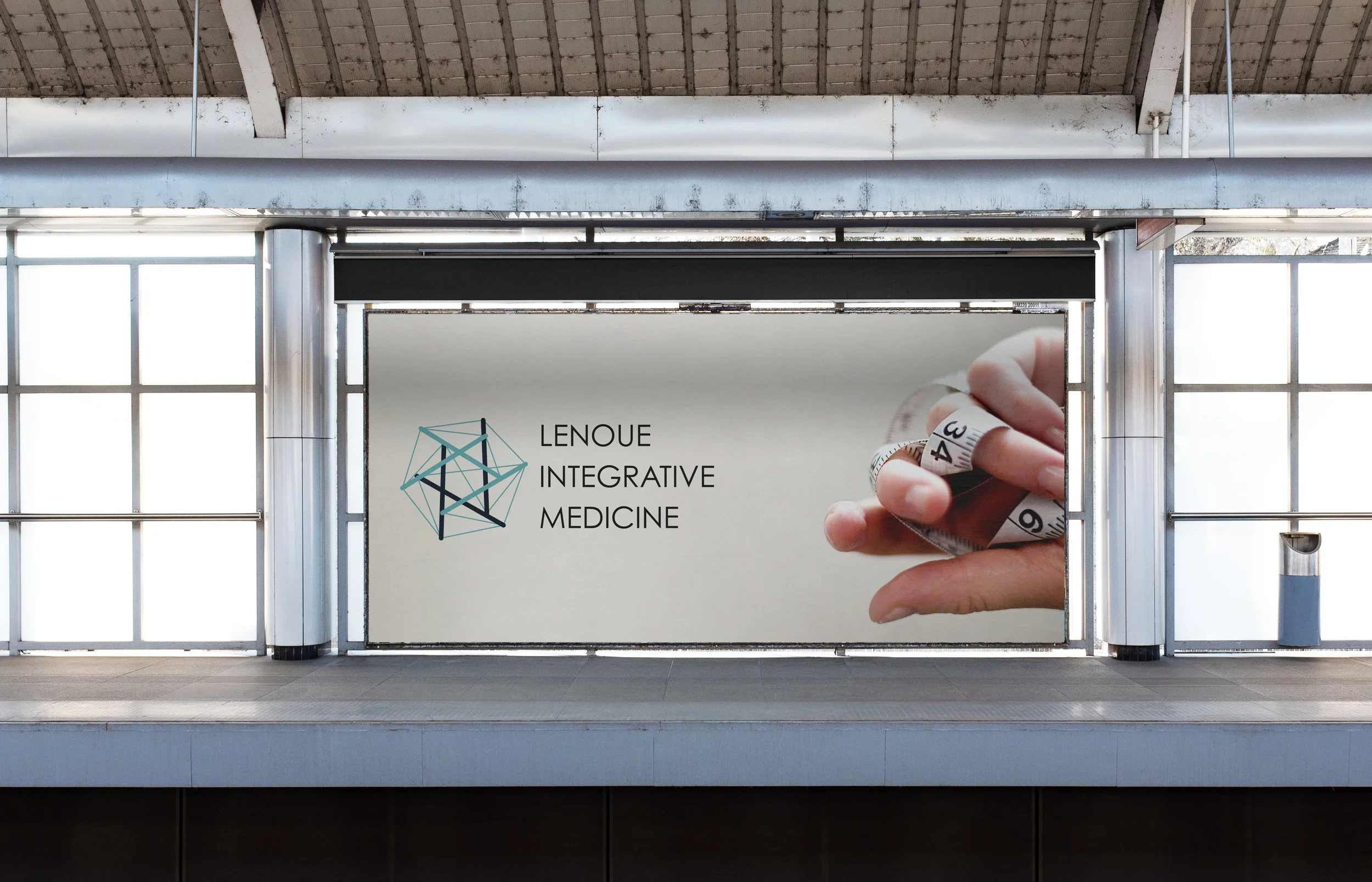
Lenoue Integrative Medicine
Dr. Lenoue is all about “integrated” medicine. The connection piece was very important to him. He wanted something that signified that pain in your shoulders might be connected to how you walk because the body, like the universe, is more connected than we think. It’s how he treats and it’s what the branding needed to be clear with as well.
-
![]()
Joe Hargrave Accounting
Joe went out on his own after workng at another firm and when he did, he became our accountaint. If you’re working for us, you gotta have soem good branding.
Joe loves the PNW, the mountains, and proessionalism so we integrated his intitial into some mountains with a nice bold pro blue. Hey, accountants aren’t just numbers people, alright.
-
![]()
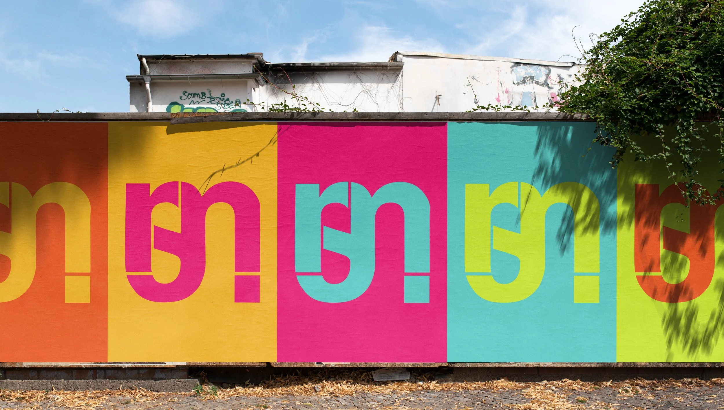
rsjm
If you’re a designer you have to have your own logo - duh. I’m such a sucker for interwearving letters and since I have two middle names and I loved Helvetica when I made this years ago - I still kinda do - I wanted to intergrate the 4 letters into one with Helvetica. Mission acomplished.
-
![]()
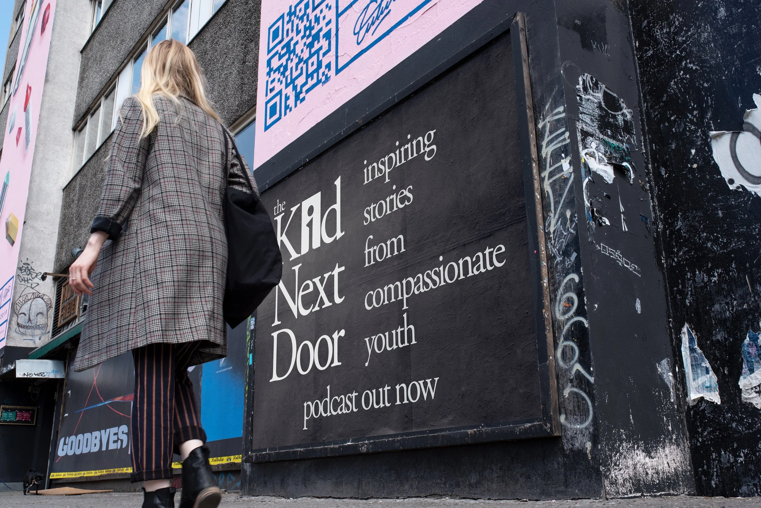
The Kid Next Door
KJ runs a podcast that features stories from kids who are showing compasion. What? Yes, we’re in.
We wanted something big and bold on a podcast - we did black and white and all kinds of 80’s vibes of colors - and a big ass font to be read when it’s small and just that kid standing in the door waiting to be let into your headphones and your heart.
-
![]()
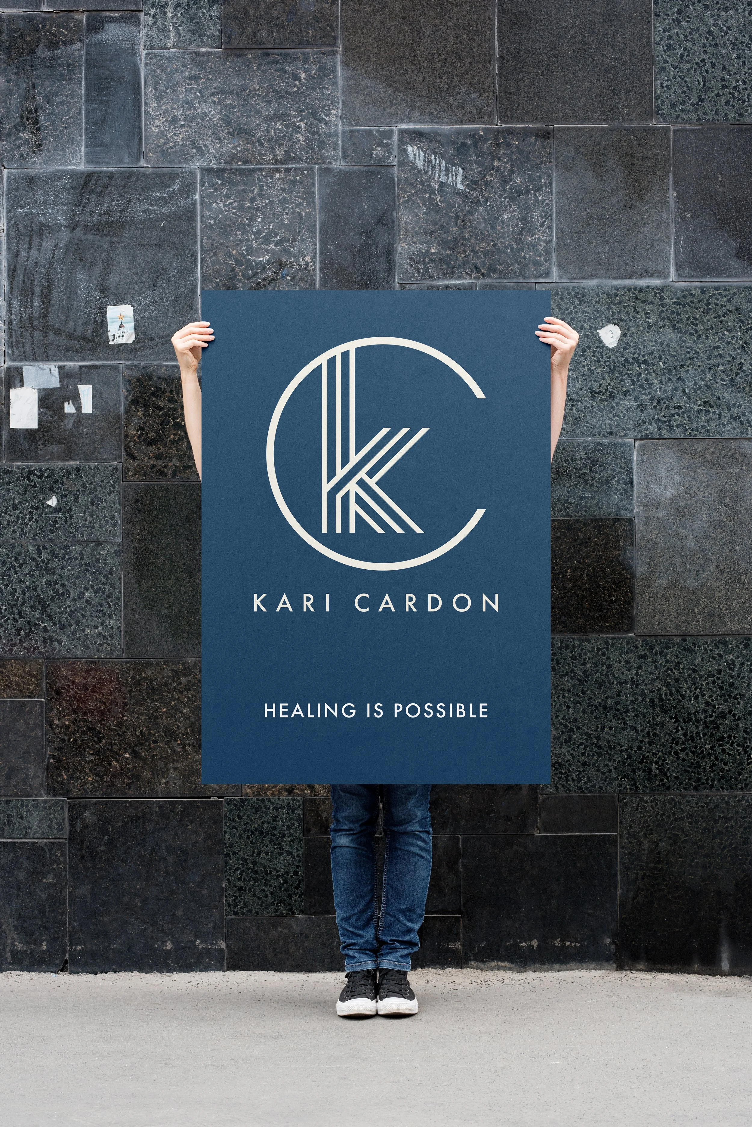
Kari Cardon
Full disclosure: Kari is Heidi’s sister and she’s an amazing therapist, doing amazing work on the cutting edge of lots of new treatments - including ketamine.
At some point, if you’re related you better have a cool vibe and site and so Kari said let’s do it!
Clean, trustworthy, and professional, just like Kari. Also cool though, of course. We love how it turned out. -
![]()
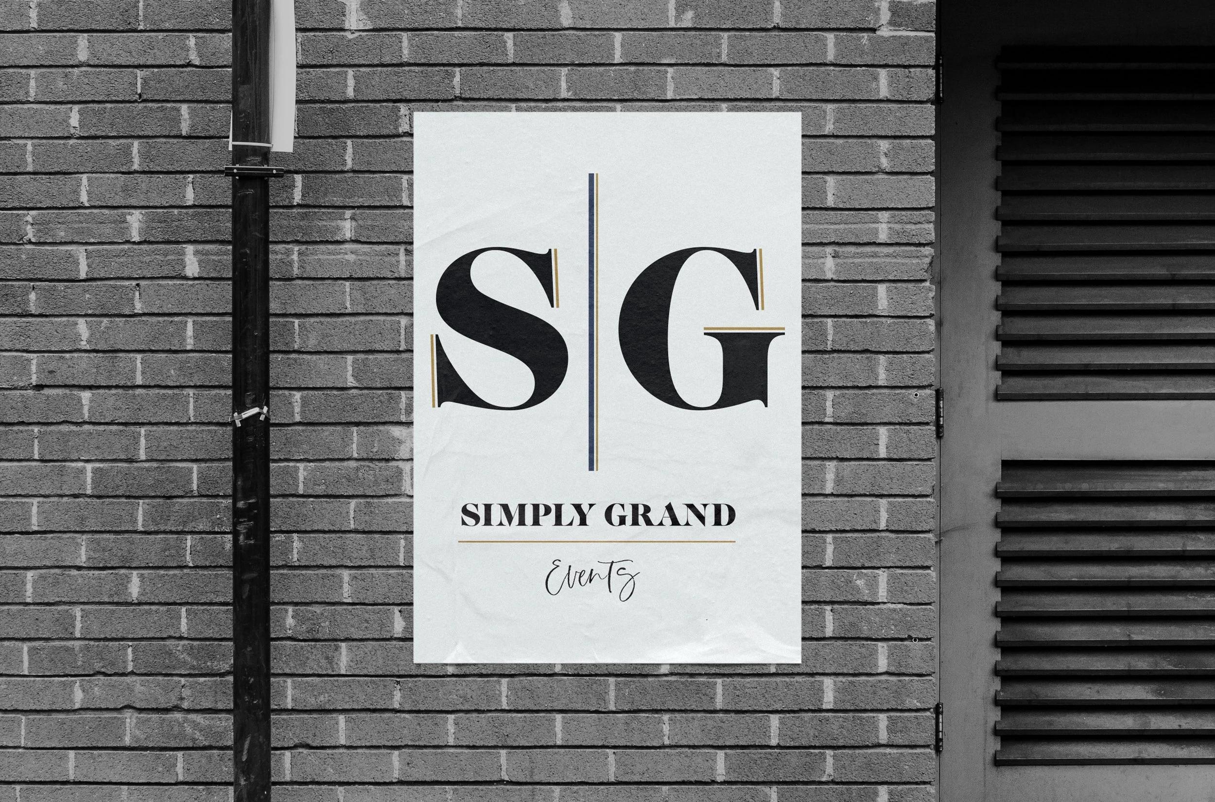
Simply Grand Events
Jodi and Becky came to us as very succesful event planners, getting tgether to do thier own brand. It neede to be elegant, high-end, and luxurious. Also they love black and white -which is cool becuase we do too, so this came around with a bit of gold and mostly black and white.
-
![]()
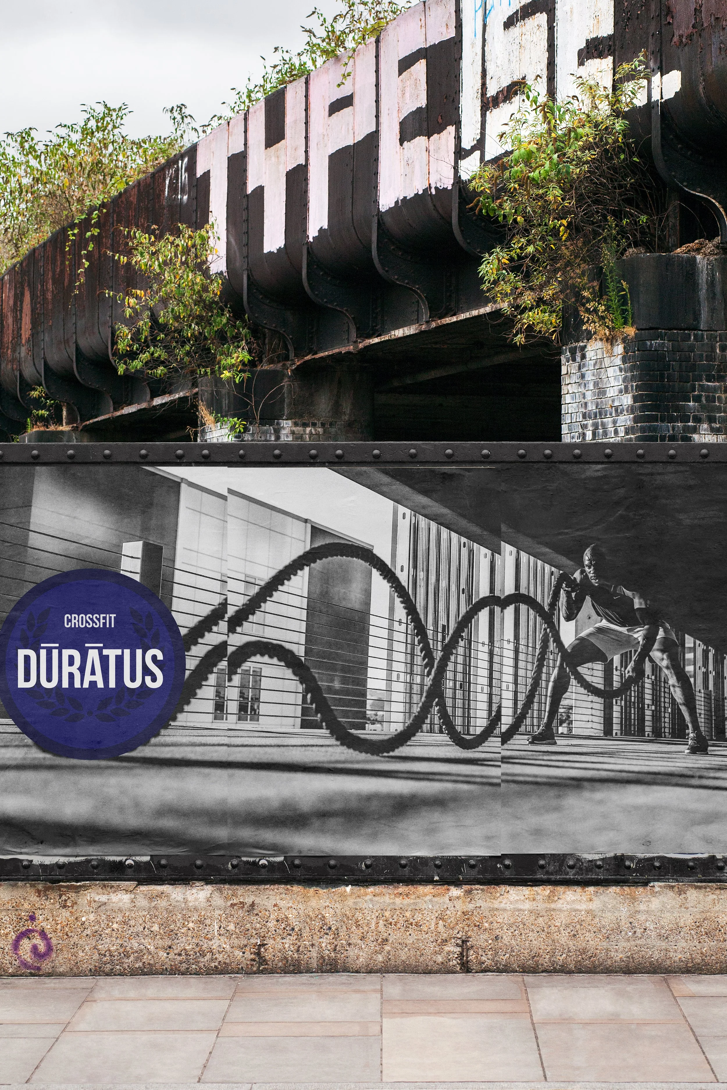
Duratus
Kevin was starting a crossfit club of his own and was insistent on Duratus and that Greek lineage stuff. Kevin is also one of the most built guys on the planet and his brand needed to portray strength. Kevin is also one of the nicest people on the planet so his brand also needed to not portray dude vibes. Lots to get in but it worked.
-
![]()
jh events
We’ve done lots of work with Jodi over the years. She recently branched out on her own and knowing us like she did, she said, I like basic and and simple and just do your thing.
So we went kind Palm Springs cool modern vibes for her spot in Coeur d’Alene to stand out with elegant simplicity.
-
![]()
Five Mile Pet Clinic
Nick bought an old vet clinic (he’s a vet himself) and told us it needed some freshening up. The sign was from the 80’s, 90’s… I don’t even know - but it wasn’t the cool 80’s or 90’s either way.
He wanted clean, modern, fun, and clear what it was. So, let’s get a dog and a cat on there and start rocking. -
![]()
Pearl and Tin
Tyler was also a succesfu event planner who needed a rebrand. The old logo was outdated and to super great on socieal media, etc… so she wanted something elegant, yes, but also soft and almost flowery - she runs a flower shop too. We went through lots of revisions - honesty, none of our initial idea were working but, in the end, we got it.
-
![]()
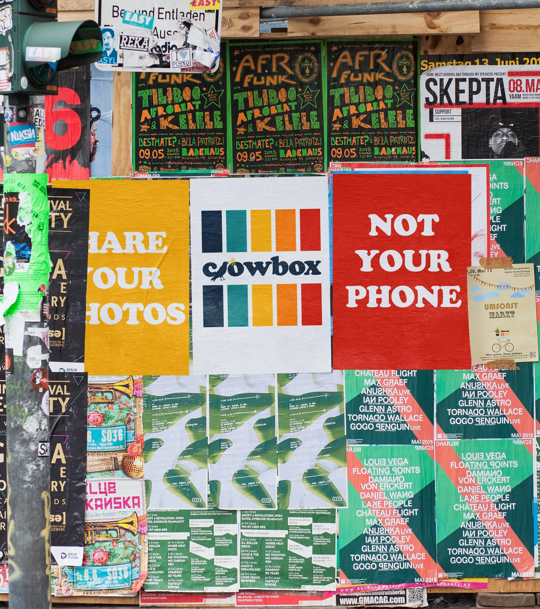
Crowbox
Crowbox is an app that came out during Covid and its purpose still works. Instead of getting out your phen to show pictures what if you could jst beam to everyone’s own phone the photos you wanted - and zoom ad all of that.
It’s a fun photo viewing app that needed some good color vibes (Polaroid) and a cawing crow because, well, that’s what you’re doing - but in a really good way.
-
![]()
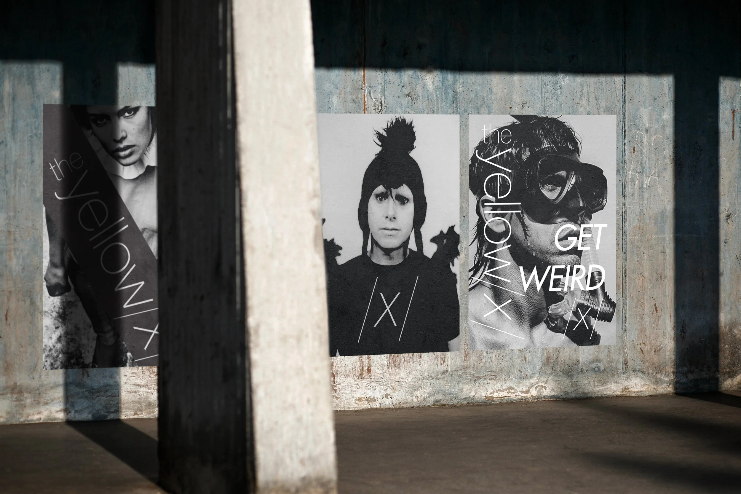
The Yellow X
The Yellow X was a Social Club dedicated to mystery, treasure, the unknown (and a kiss) that was meant to bring people together in a way that wasn’t being done in a space with Berlin, London vibes and a nod to Depeche Mode - thus the Anton Corbijin photos.
Simple logo was all that was needed, and an “x” that could appear everywhere and be noticeable. -
![]()
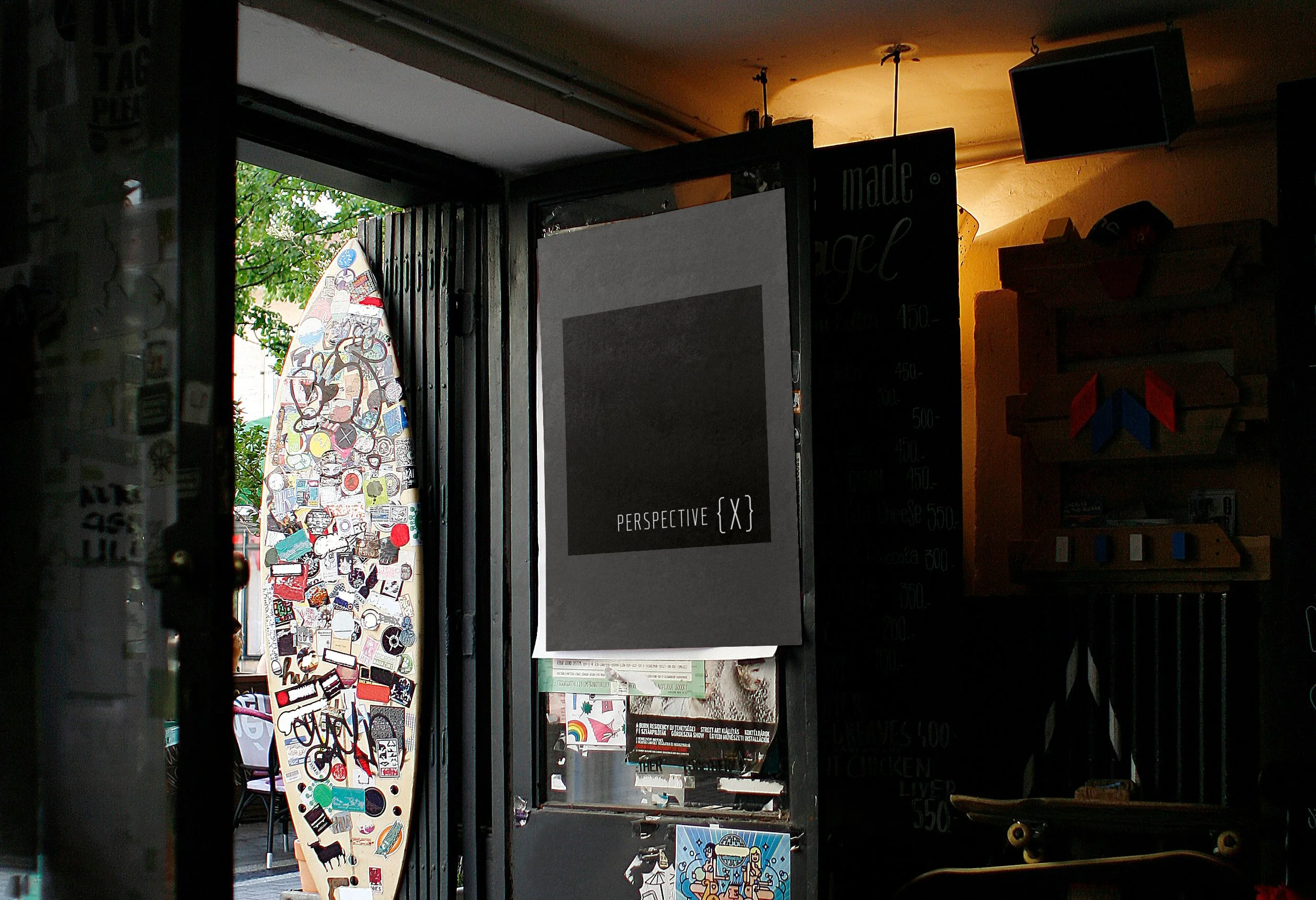
Perspective X.
Back in the day, Jordan came to us with a new podcast idea: to come at topics with mystery and the unknown, more than expertise. They wanted a design that was easy, nothing too much, and would work on in podcast format (obviously).
We kept it simple and straight forward and dope on a black background.
-
![]()
rebloom
Rebloom was a studio that was all about teaching women to become better more true versions of themselvees. Beautiufl. We wanted a design that showed flexibilty and strength, along with the movemnt of growth elegance and we feel like we pulled it off.
-
![]()
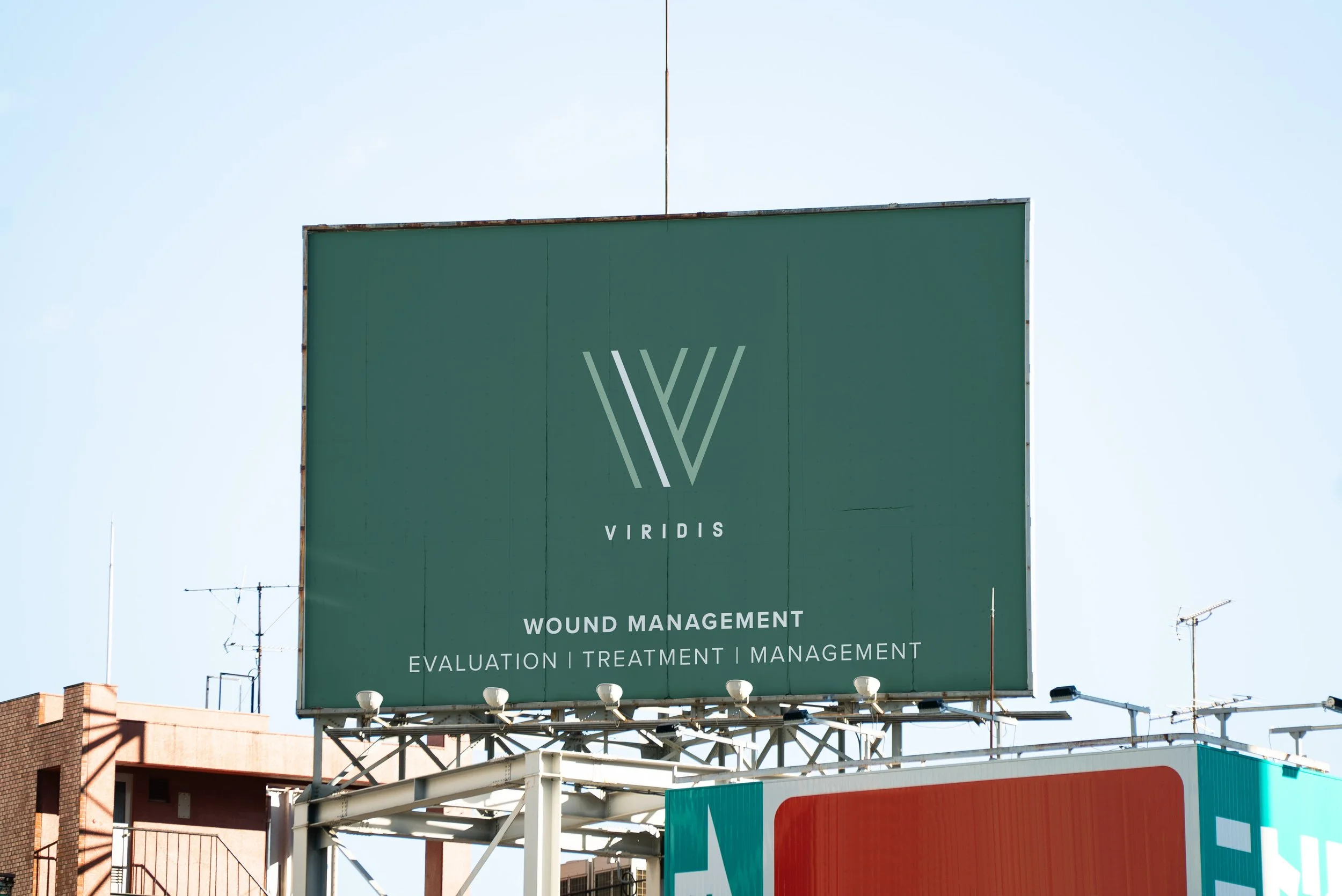
Viridis
Viridis is doing wound management, honestly, something we had never heard of. :) But, such a cool project because they are doing it with care, growth, and warmth and just that idea of “green” and tender shoots of plants.
We had all kinds of ideas but this one really captured a pot, growing, and something tender and fragile that can grow.
Website -
![]()
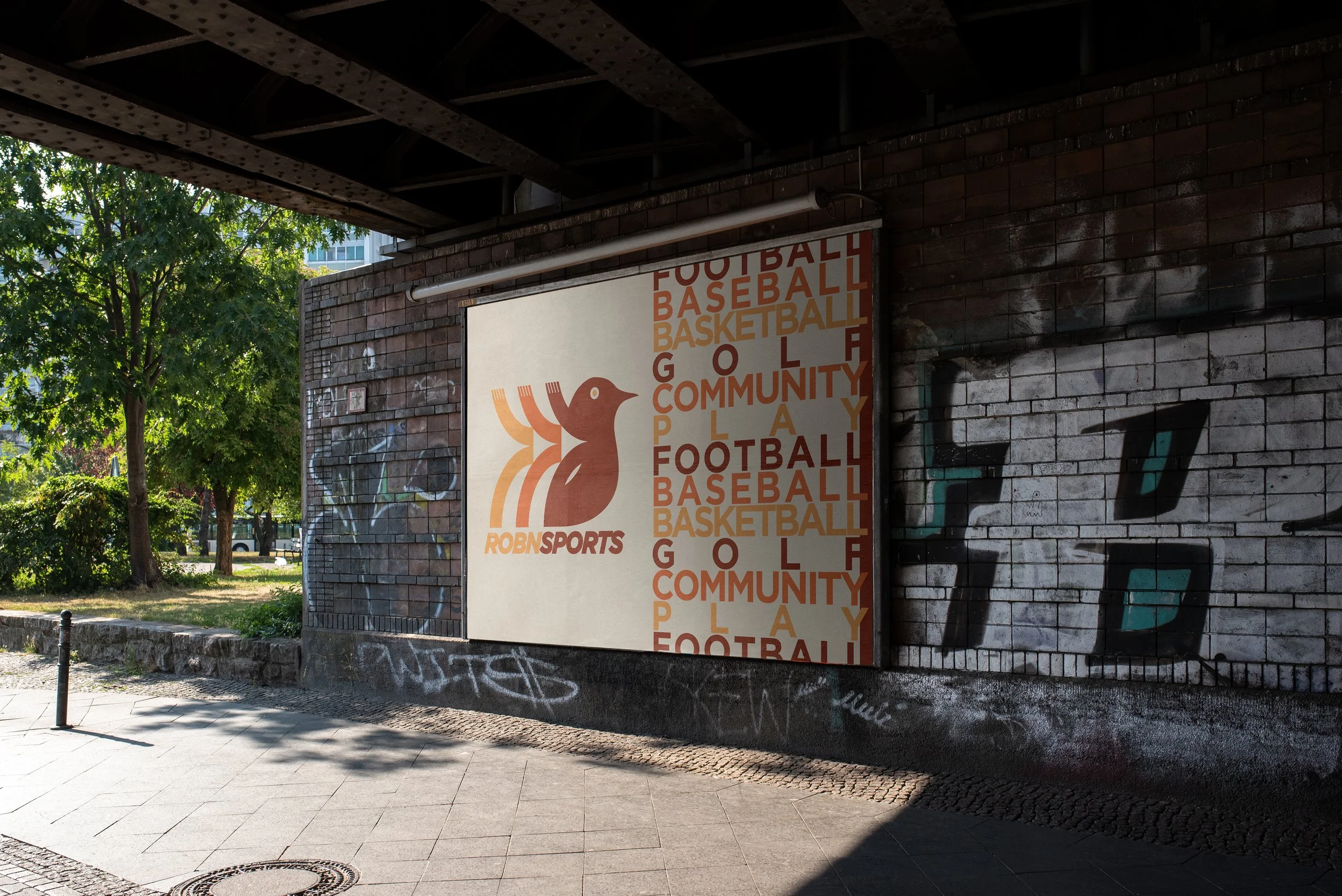
robn sports
Will is one of the most effervesent humans on the planet and this brand is goin to be huge. We won’t say a lot about it for now - because it’s in the earliy stages but trust, it’s about sports, community, fun, and 70’s nostligcal vibes.
coming soon
-
![]()
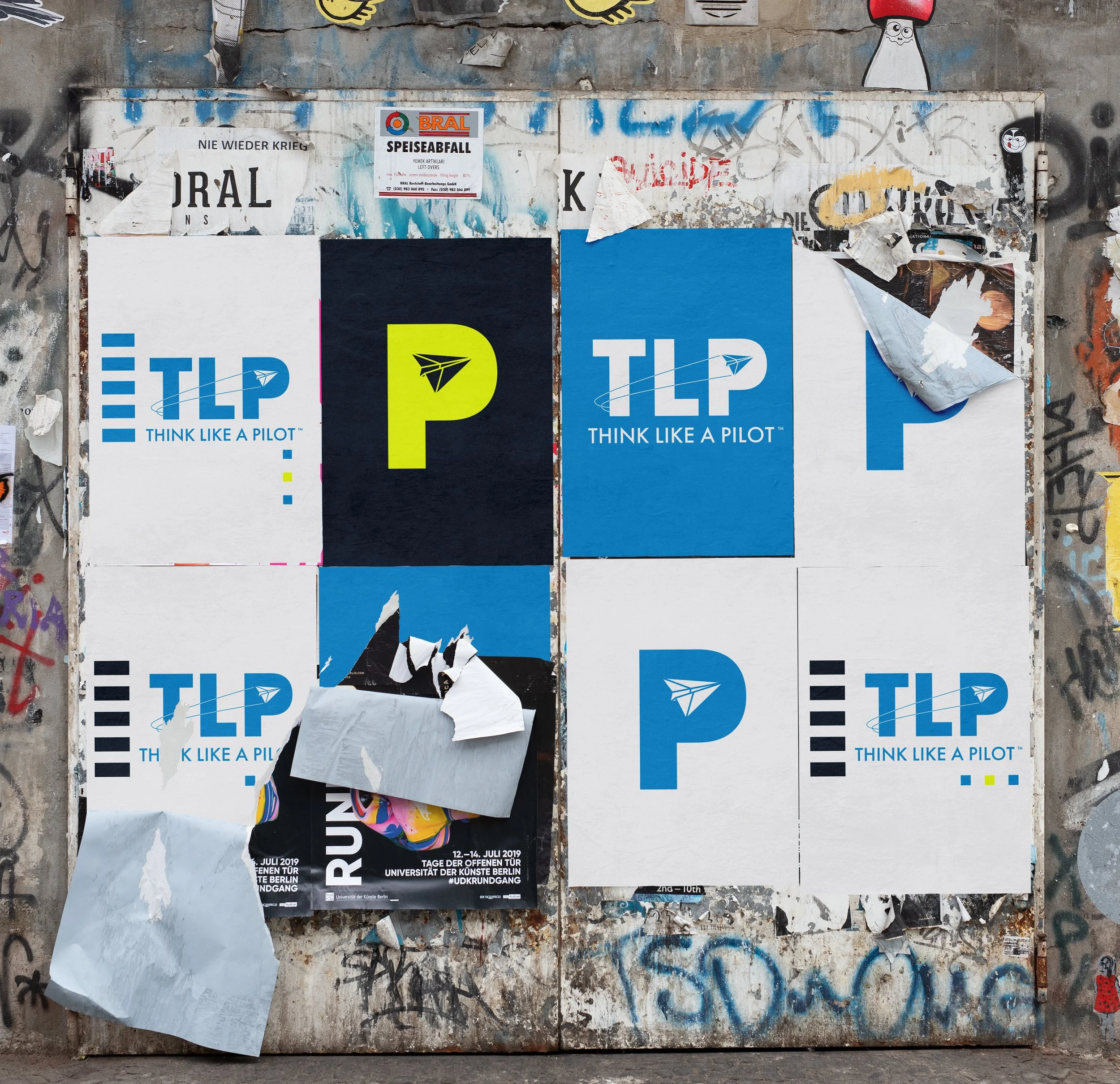
Think Like A Pilot
Bobby was alreayd a public speaker when he deicded to know everyhing there was to kow about flying. He got his license, instrument rating, etc… and is now brining all fo that to his public speaking and lettng leearn.
This was a dream for Ryan (avgeek) and, if you didnt know every airpot hs a 3 letter code so we went with that idea and let it flow from there. The paper airpl.ane was a little more friendly than a jet (we wanted frindly an fun) and jsut bought it all together.
coming soon
-
![]()
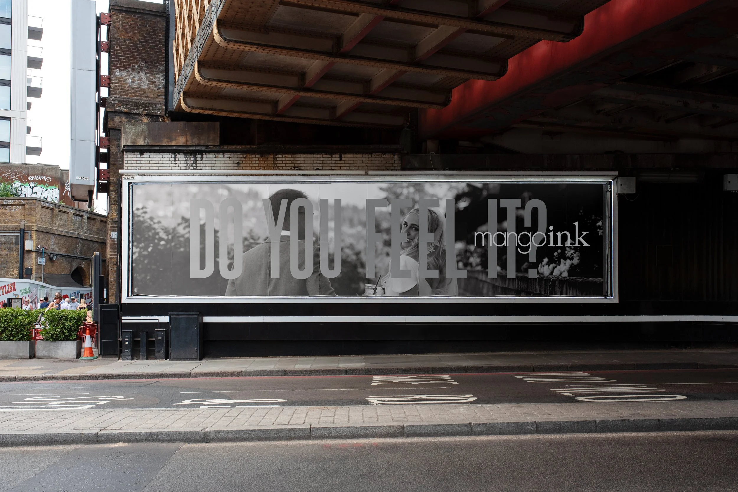
Mango Ink
Our other baby: luxury wedding stationery and letterpress. We’ve been going 20 years and a few years ago, it was time for a new logo - though that old guy had last a solid 12 years or so. We kept the old vibes but modernizied and cleaned it up a bit to match our new style a little better. We really do love it
-
![]()
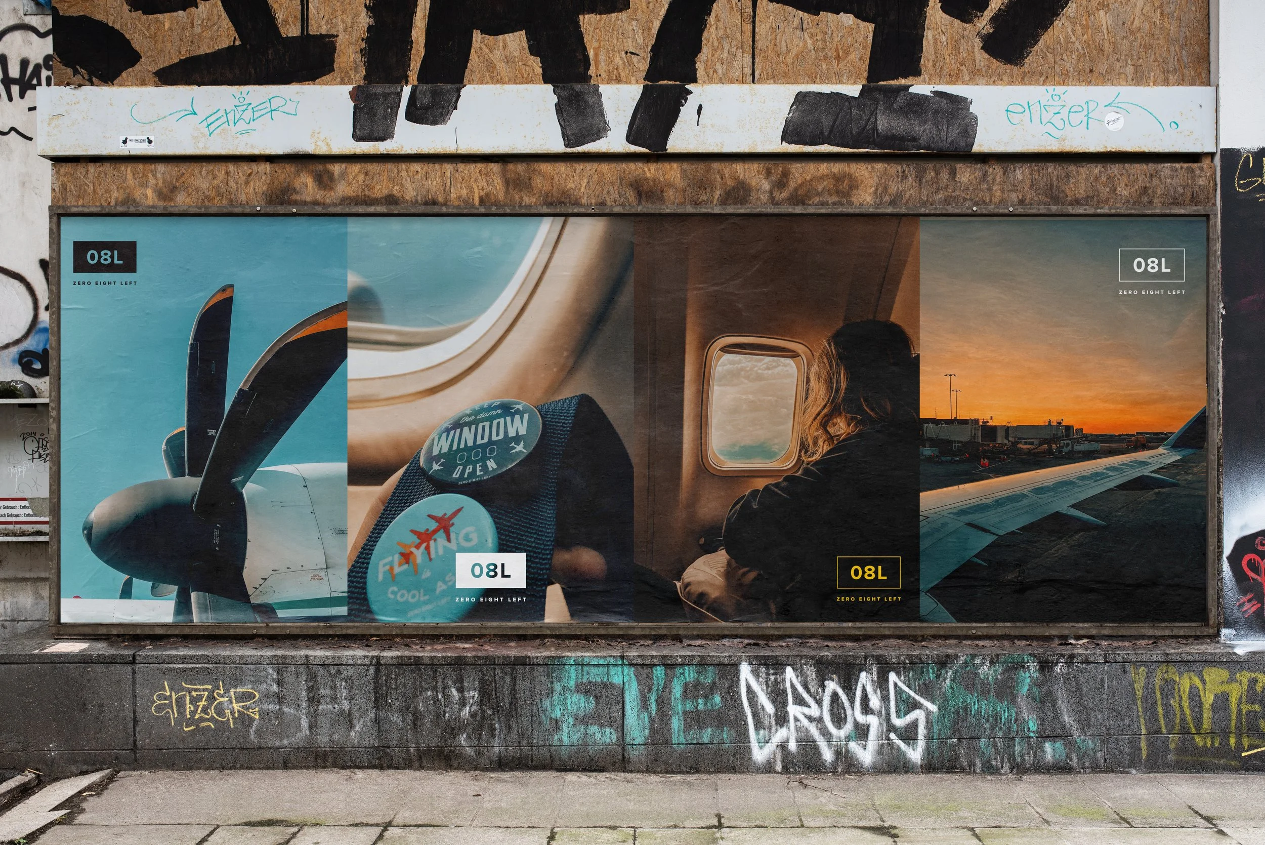
08 Left
Our company: Ryan’s passion. He’s a true avgeek and after having the same logo for almost 10 years, he decidef it was time for an upgrade. Sometimes designing for yoursel is the aboslute worst and, in this case, it was. We sepnt months designing a new logo that we sorta liked. And then one day, Ryan was alone and said “Why am I fighting this so hard? 08L Is a runway and the logo just needs to be the simplest, cleanest, design of a taxi symbol. Done. Finally.
-
![]()
Hunter Kardong
A new law firm that will be a bit vague on specifics for now. But they wanted trust, professionalism and, gasp, something not seem in the law world very often: modern. No pillars please. No serif fonts.
Again, love the way it all ended up with negative space, triangles, and professional modern law.Coming


In case it’s not clear, these are all mocks of the logos. Why? We’re tired of just logs on blank colored blocks and we had fun showing them in a variety of real world type fun.
If you want actual real world of how they all played out, visit the sites associated with each. They’re all doing cool stuff with the branding!